2 minutes
No one can argue that the entrance of a physical supermarket is the first representation of the store. Creating a warm welcome is necessary; whether by keeping the entrance clean and spacious, or having colorful advertisements promoting the latest loyalty programme.
However, as digitalization picks up speed now, and shoppers are leaning towards doing their groceries online, your digital store's entry is not any less important. Read further to discover more about our analysis of digital entries of supermarkets worldwide and its findings.
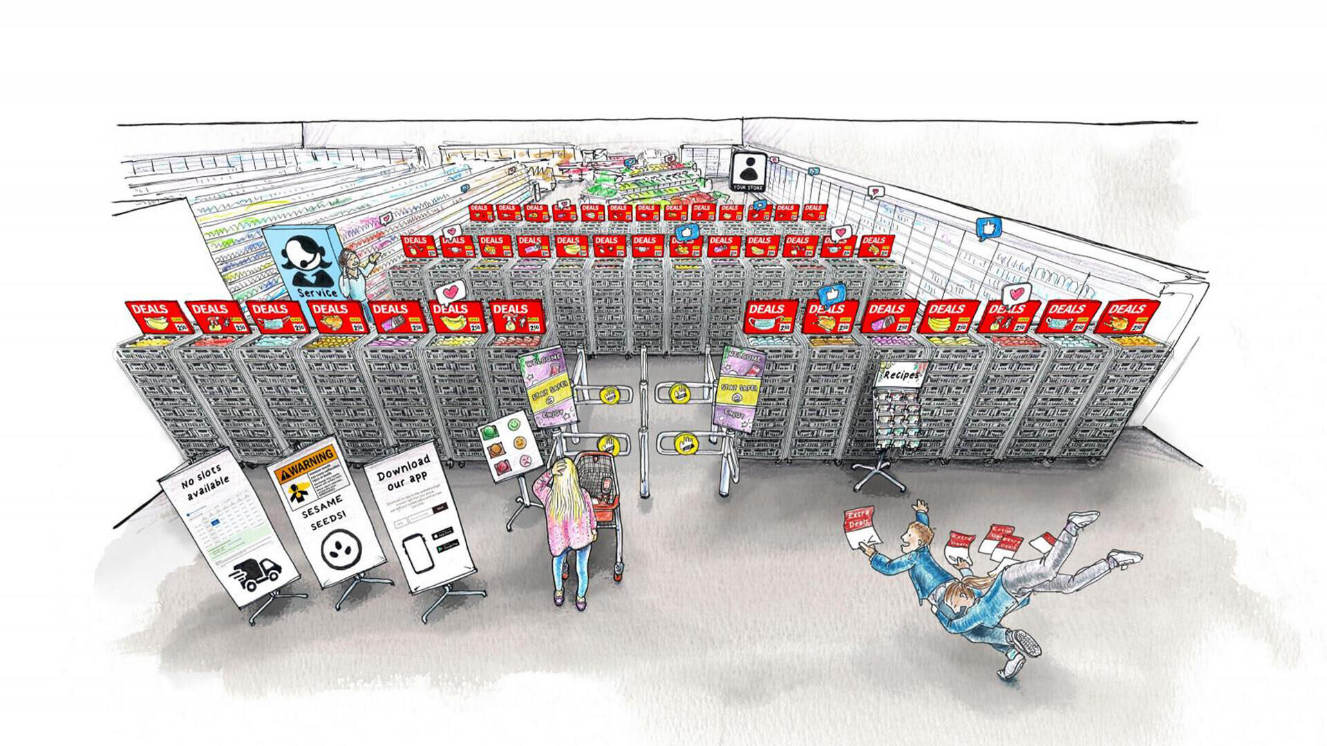
Interrupting shopper experience with pop-ups & promotions
Several obstacles can cause disruptions in a shopper’s journey through your digital store if not taken into account. And it all starts at the entrance.
Making sure the digital entry is not overloaded with promotions is an essential factor. Such excess of information can feel like a fight for attention. Additionally, an overload of other pop-ups and messages can also confuse the shopper in getting what they came for: cookies consent pop-ups, product recalls, closed order slots can become irritating.
Delivering the right message and context
Conducting a quick analysis of various food retail websites reveals how their digital entries are often pushing visitors’ stress levels by mixed messaging. A clear structure is a must, which often is overlooked. Same as in the physical store, a shopper aims to have an efficient and smooth journey, knowing exactly where to look for what product. Lacking logical product matching (chicken is placed next to soap) overburdens the journey of the shopper. Next to this, an entry should communicate relevant context; if there is nothing about a marketing campaign that the shopper has seen or what’s relevant at this time of the year, the communication is poor.
Looking at digital touchpoints should be no different than weighting the importance of physical store entrance. In order to stop the confusion and irrelevant attention-seeking, a digital entry should scream less, present single-minded messages, just like the aisles within a certain category. Pop-ups and warnings should be crafted with care, and the best fresh products should be put right upfront to create an appetite. In a sense, less is more. When the physical store is neat, the digital one shouldn’t be overcrowded too.
Want to learn more about the shopper journey?
We have created a workshop to inspire you to do things differently. Get in touch and we will help you and your team to design this warm welcome for your shoppers.
Get in touchSee more retail news and articles
Go back to the news overview to find out more about what BrandLoyalty and our partners have been doing as well as key industry insights.
Go to overview